Chart 1: VIX vs SPY

Chart 2: Put Call Ratio vs SPX
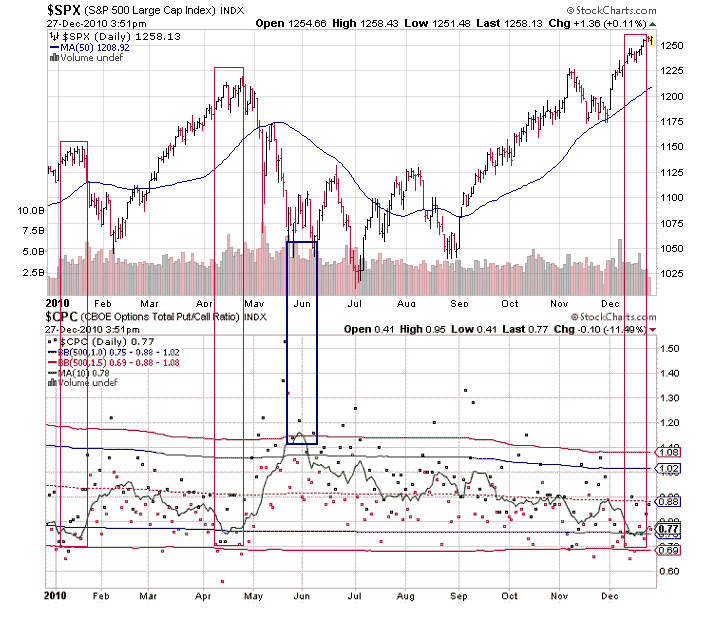
I've calculated and added a 1 and 1.5 standard deviations as well as a 10 day moving average. The nice thing about the put call ratio (compared to the VIX) is that it can give you buy signals as well as sell signals, such as the buy signal in June, or some 200 S&P points ago. Now however, like the VIX, it is signaling that investors are overly optimistic and complacent. I've highlighted some previous examples of when conditions were similar and an almost immediate sell-offs occurred.
While discussing the put call ratio it makes sense to also review some of the other sentiment indicators, namely the Investor Intelligence and American Association of Individual Investors.
Chart 3: Investors Intelligence

The bull bear spread is reaching generally bearish levels. I've highlighted some of the other recent instances when the spread was this large between bulls and bears, all of which preceded corrections of various degrees, included the top in 2007. Advisers, who blew monumental opportunities to sell the 2007 and buy the 2009 bottom are back at it again. After a record run in stocks, now they are bullish. Individuals seem to agree, see the below chart.
Chart 4: American Association of Individual Investors

Another look at the current McClellan Oscillator.
Chart 5: McClellan Oscillator vs SPX

I prefer to sell the market when the McClellan is much higher, however sometimes I have seen divergences, which usually occurs right before intense, fast declines, such as in "Flash Crass." You can see the divergence develop in the chart above. The McClellan got very overbought and then a huge divergence developed, seemingly with no market reaction, then the market dropped suddenly in May. More recently, starting in August, the McClellan has possibly been diverging for months. While one can make the argument that the market will continue to rise until the McClellan is overbought, which normally I would agree with, but the summation index also shows both a large long term divergence, and a short term small divergence between this and the previous most recent peak. This makes me lean towards the bearish interpretation.
No comments:
Post a Comment